Logo Design
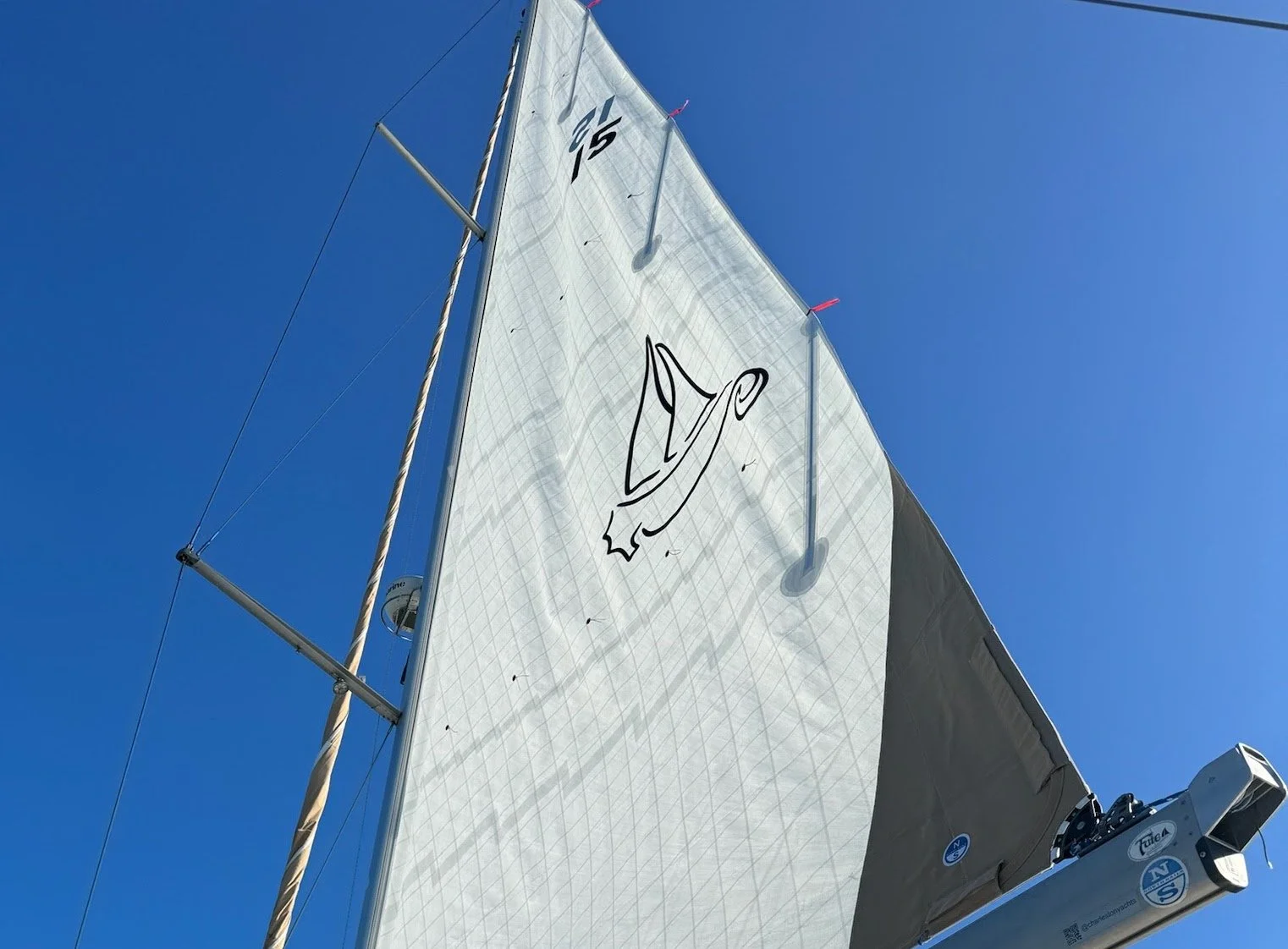
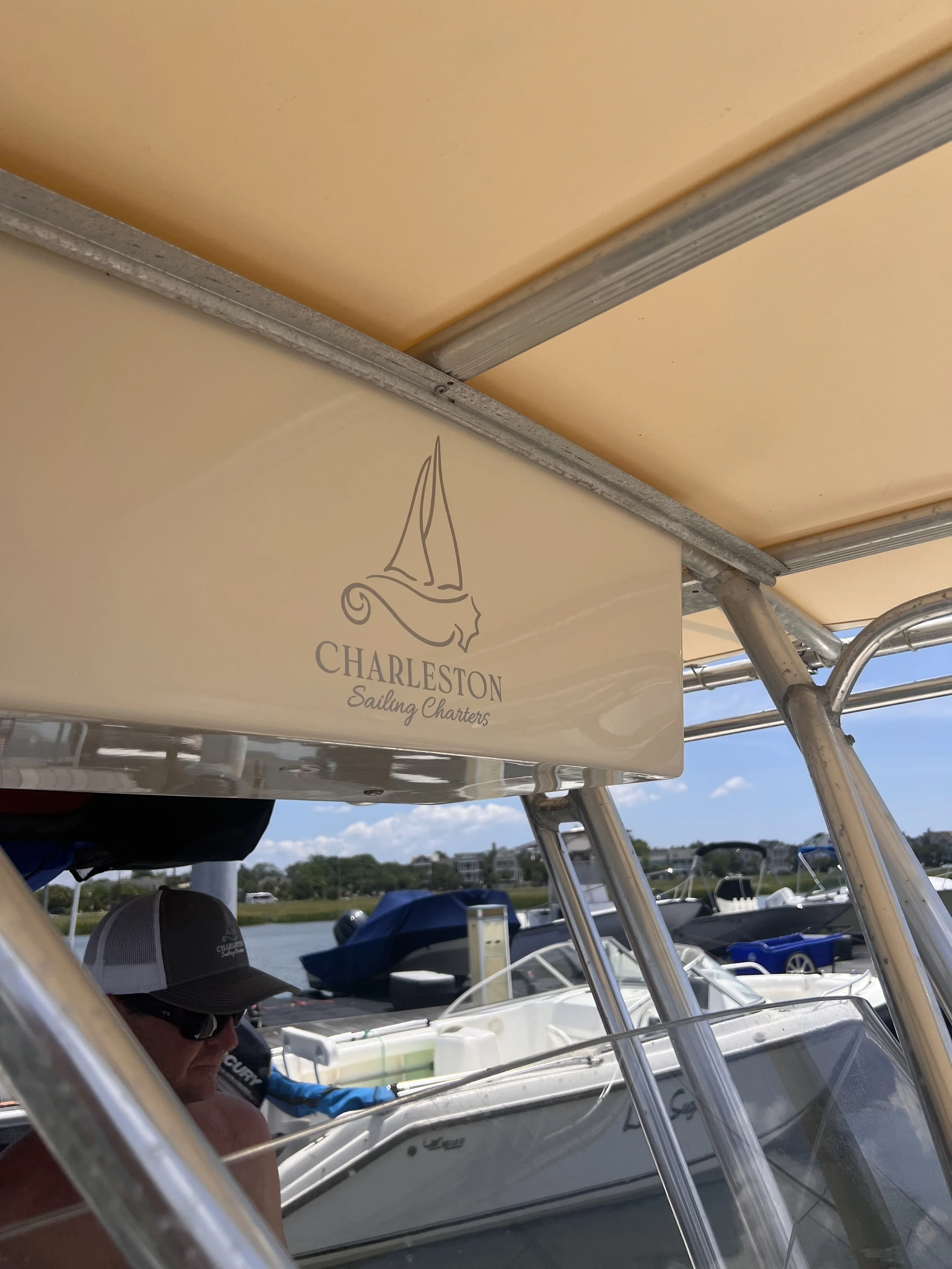
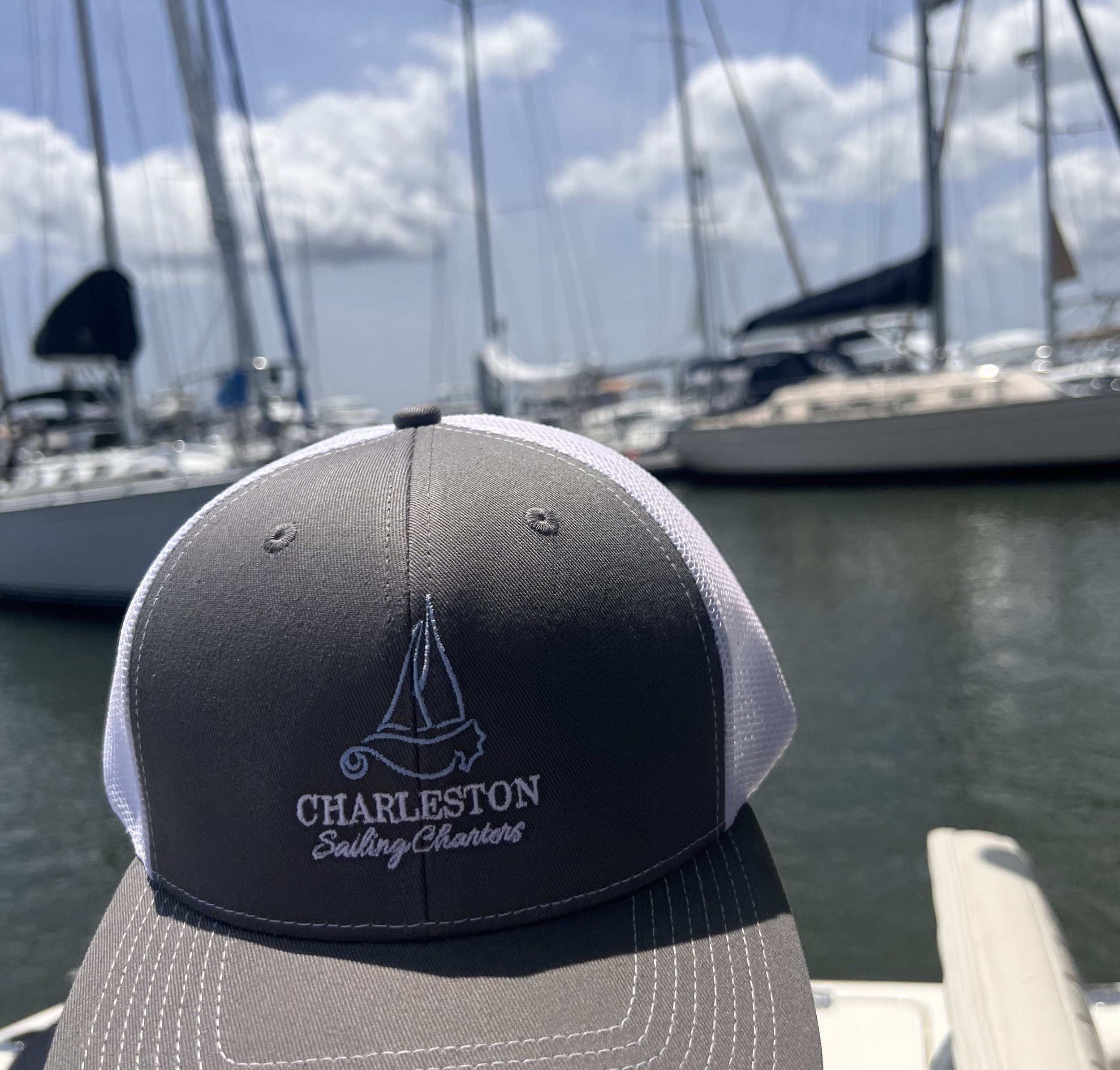
Charleston Sailing Charters
The goal was to unify three boats under a single brand name for stronger recognition. Using whimsical, thin-line seahorse imagery, the logos were designed to reflect the style of their sailboats while creating a cohesive and memorable visual identity.
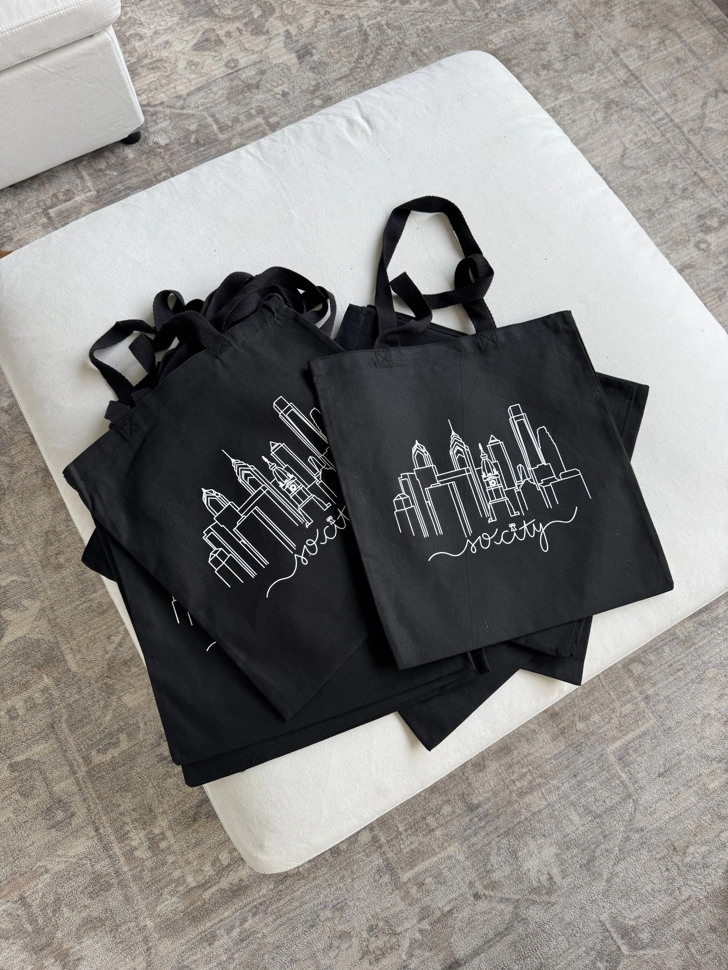
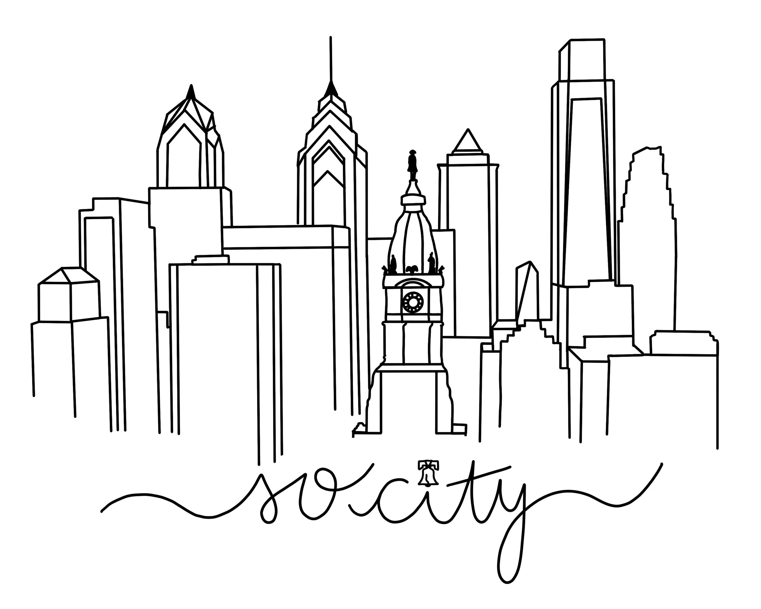
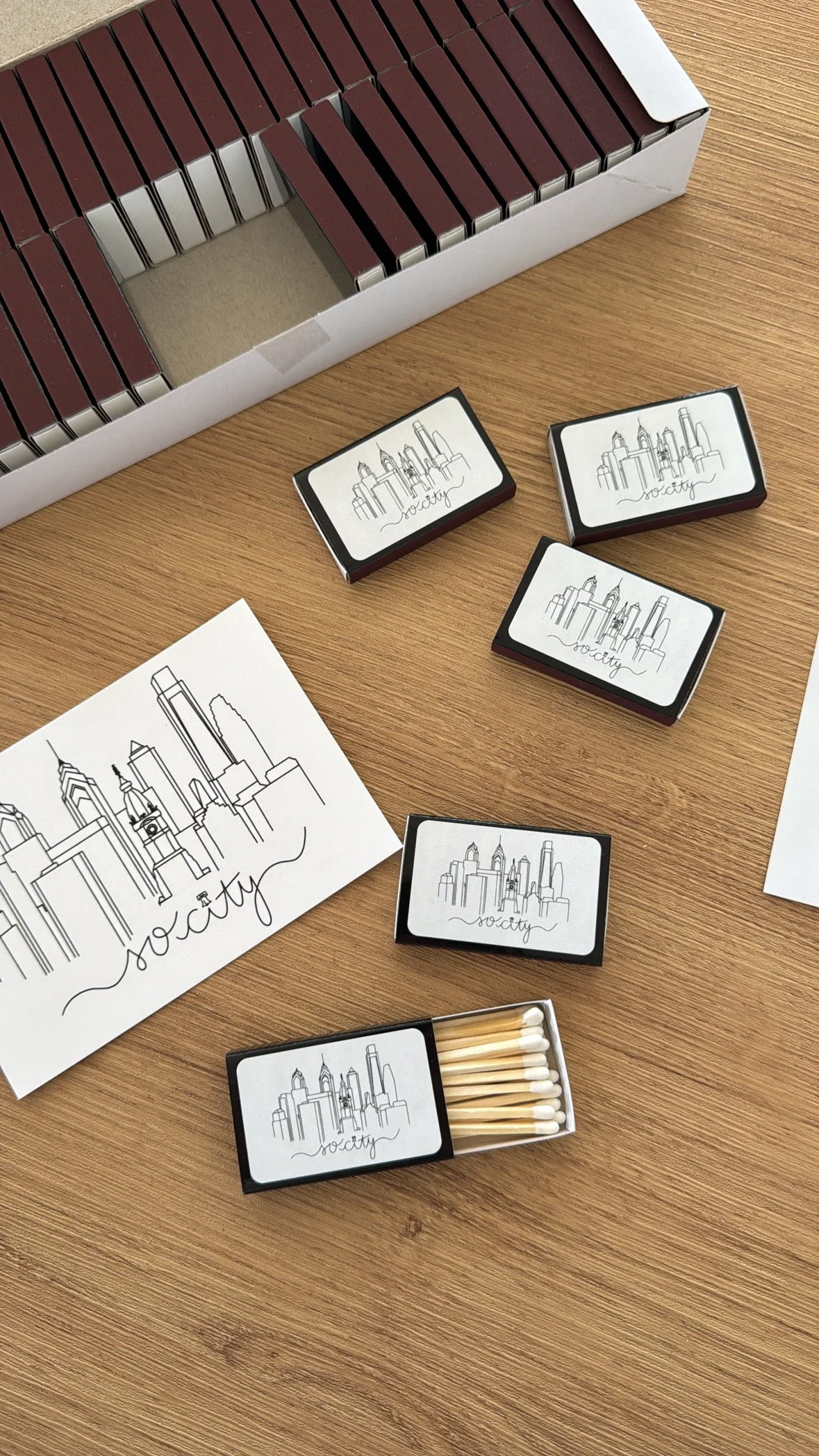
Girl Gone City
A simple line illustration of the Philadelphia skyline paired with the phrase ‘so city’ in a clean cursive font. Designed for versatile use across tote bags, thank-you cards, and other branded merch, the logo captures a chic, city-proud aesthetic with minimal, modern charm.
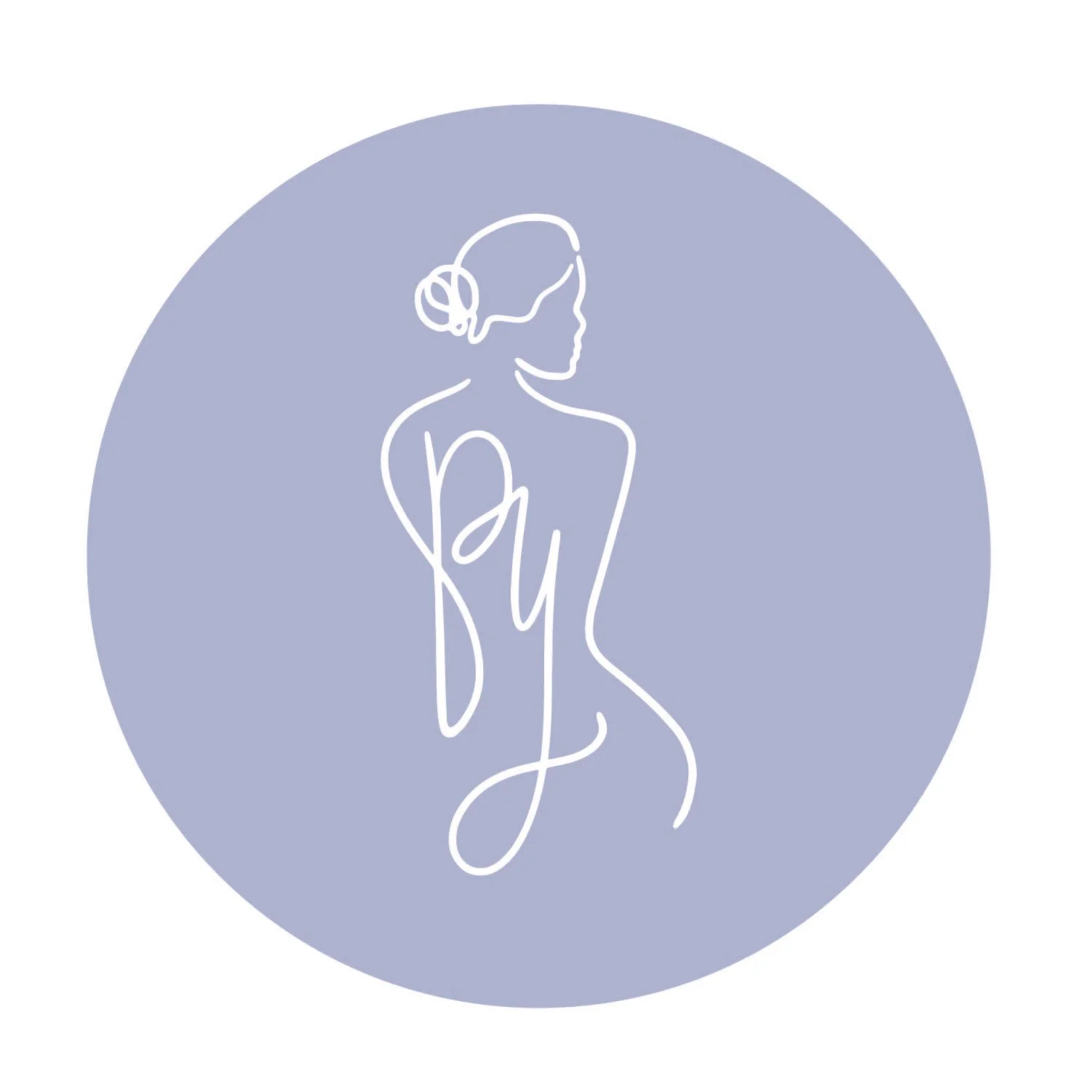
Pace Yourself Counseling Collective
Designed for a therapist focused on helping women build healthier relationships with body, food, and movement. The logo uses a fresh mint, lavender, and gray palette to convey calm and clarity, while steering clear of industry clichés.


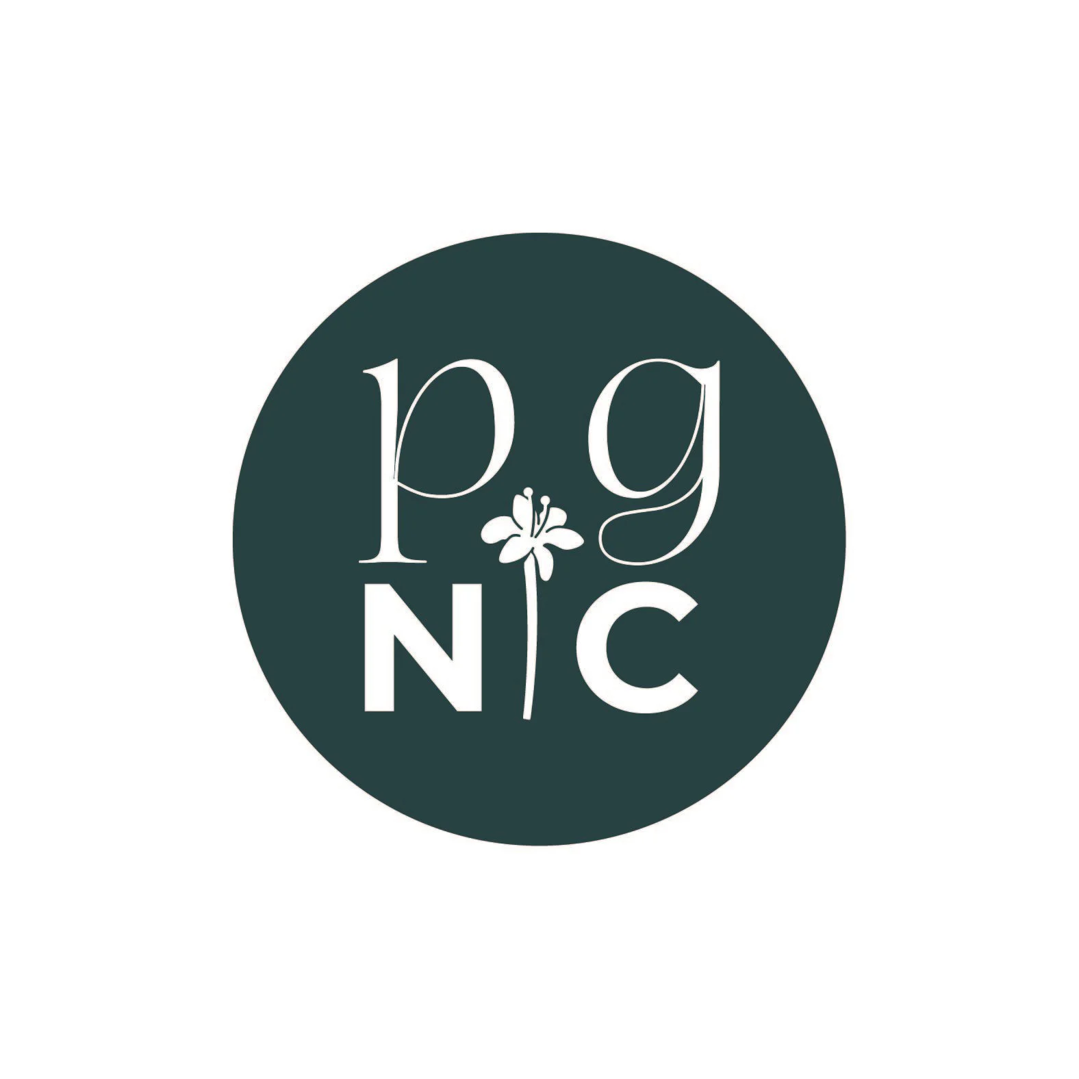
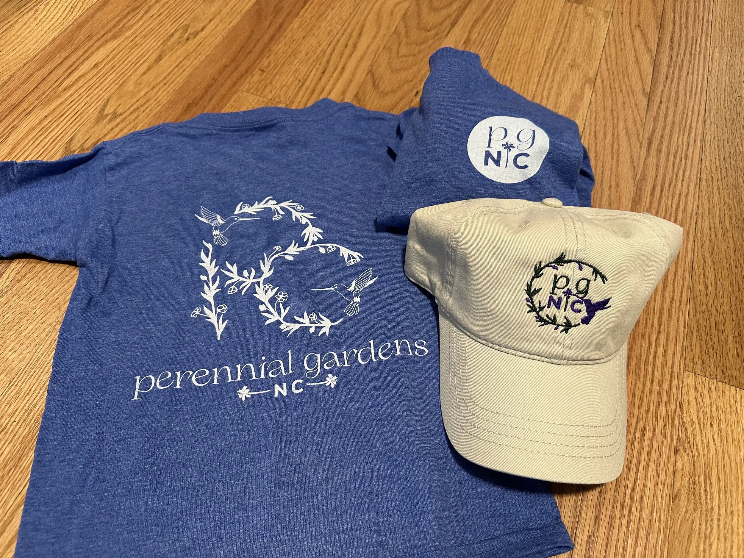
Perennial Gardens NC
A relaxed, nature-inspired logo featuring intertwined vines forming the letters ‘PG,’ accented by two hummingbirds. The design blends organic elegance with readability, capturing the brand’s love of growth, beauty, and the natural world

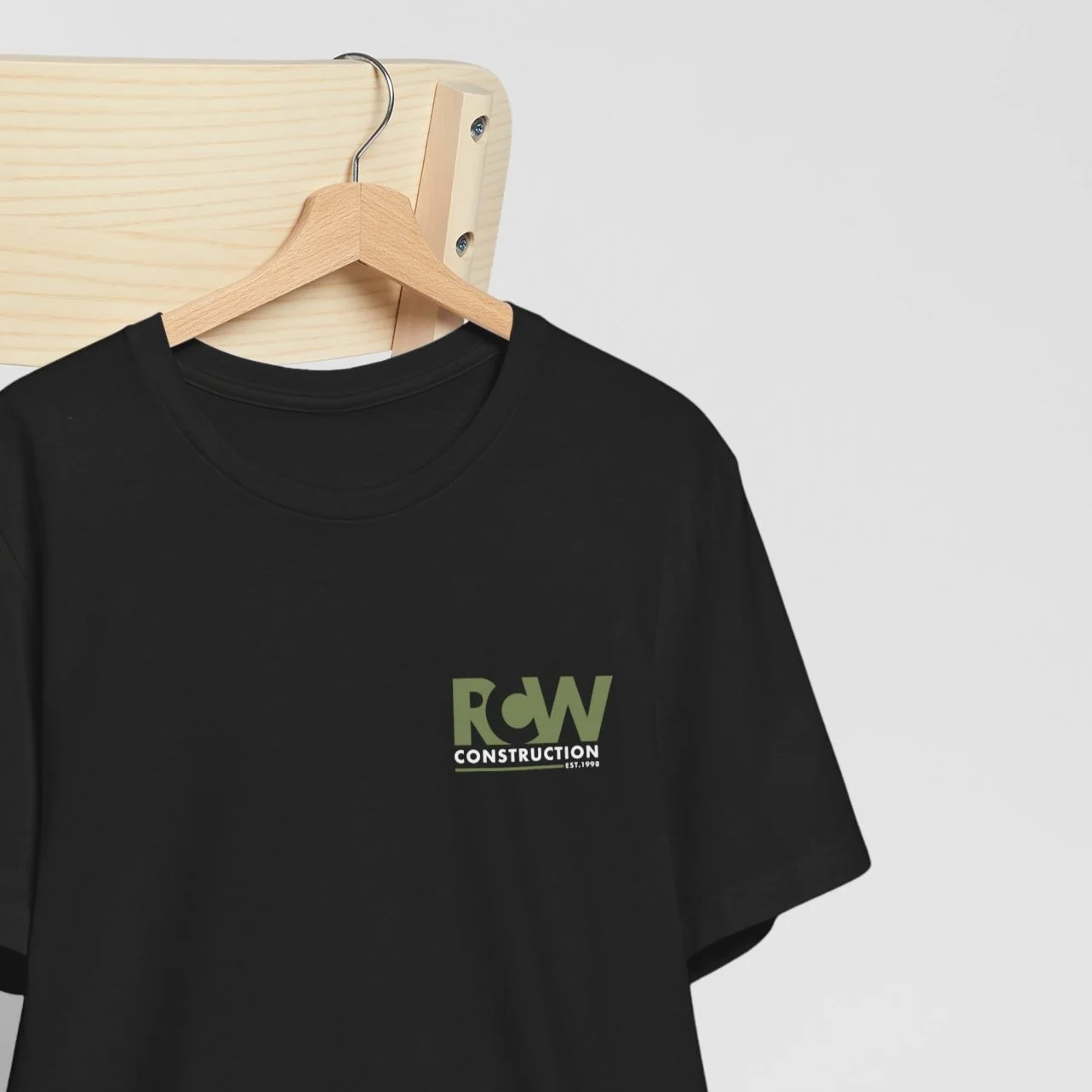
RCW Construction
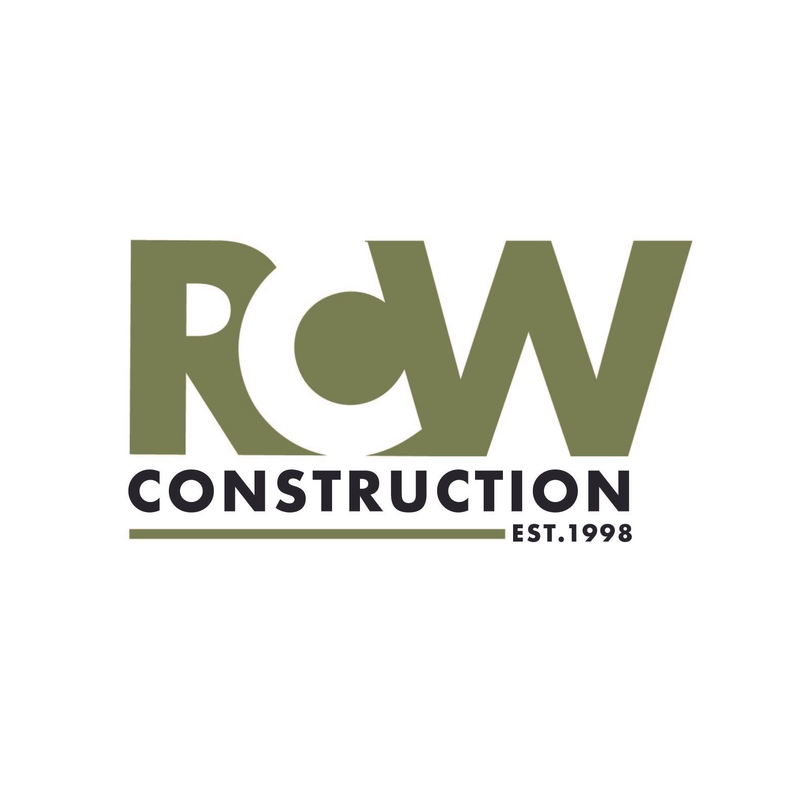
A family-owned business since 1998, RCW Construction wanted a modern, versatile logo that honored their history. Designed to stand out on black t-shirts and vehicles, the logo includes ‘est. 1998’ and color variations, combining clean simplicity with strong brand presence

Ignite Change Counseling
A minimal, line-art flame designed to symbolize growth and transformation — soft rather than harsh, reflecting the warmth of therapy. The rose gold palette and cursive typography bring a modern, boho feel to the brand’s calming identity


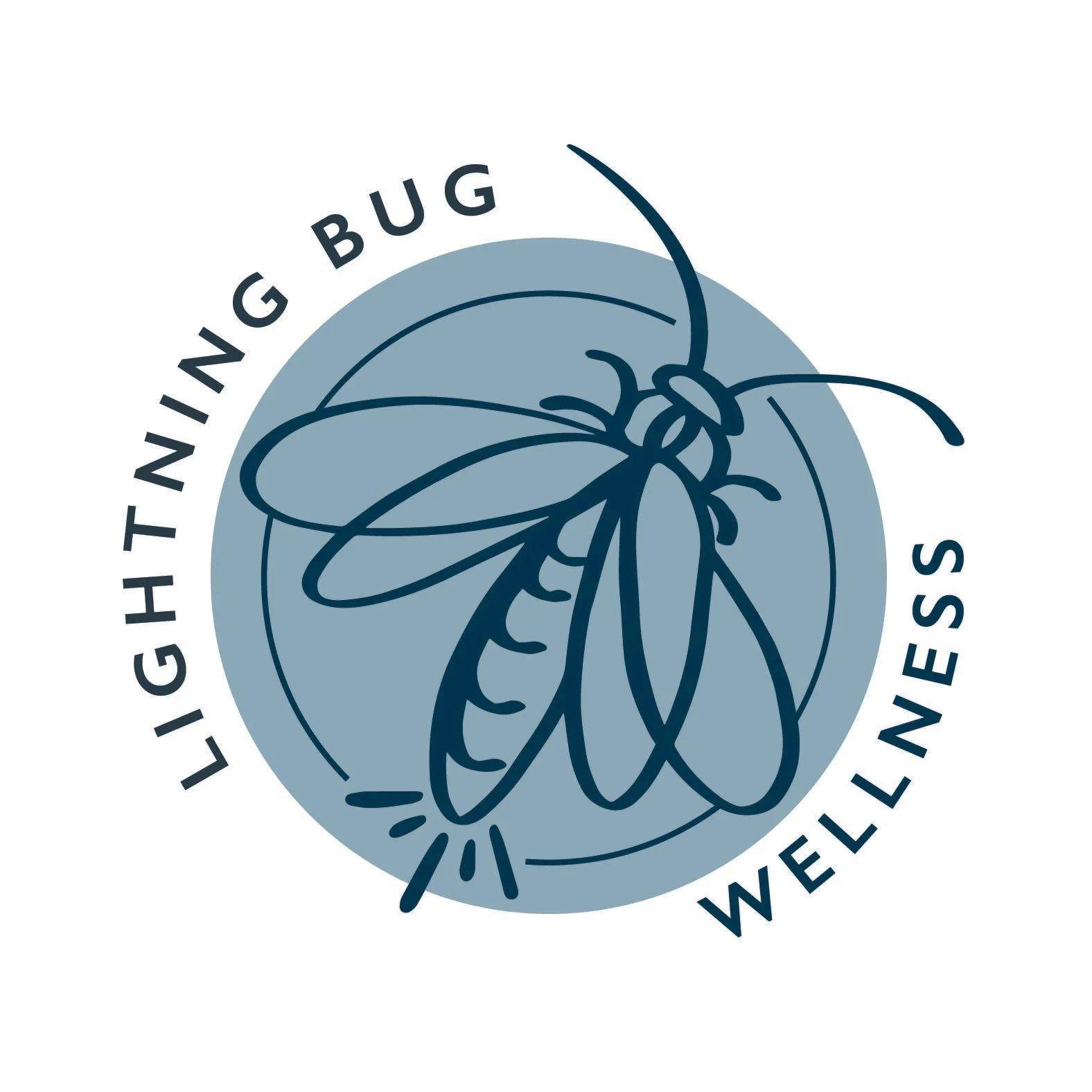
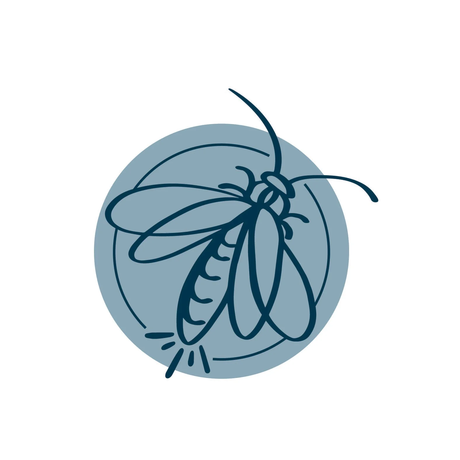
Lightning Bug Wellness
A clean, minimal logo featuring a lightning bug with open wings, symbolizing light and renewal. Designed with a timeless san-serif typeface — classic yet approachable — the logo and typography work together or independently for flexible brand use. The stacked layout of ‘Lightningbug Wellness LLC’ reinforces balance and simplicity across all applications.